Thursday, 4 December 2014

Tanya Taylor SS15 New York


Similarly to last year Tanya Taylor had a bright and airy collection that made coral a must have colour to wear as clothing and on the lips! The clothing had some really nice patterns and funky cut out shapes to spice it up a little. 


The lead Make up Stylist for the show was Uzo From Nars Cosemtics.1 She created this wonderful look to compliment the clothed keeping the bright coral orange as the theme.
The look - "The Tanya Taylor women is always crisp, fresh and bold. She loves a surprise and appreciates the unexpected. Her make-up mirrors that expression again this season wit classically radiant and highlighted skin combined with a shockingly bright orange-red lip"2
To create the look Nars cosmetics took the lead. To being with Pure Radiant Tinted Moisturiser was used on the skin.3 I have used this product from Nars before during the summer period. It is a really wonderful product it goes on really silky and smooth and I especially liked how it gave me a healthy glow. Without powdering it gave me a really nice dewy look. The coverage I would say is somewhat light to medium, this look has quite a natural feel to it so is perfectly suitable. I think this has helped create the fresh face spring time look for Tanya Taylor's show. This plump and fresh look is symbolic for spring time especially. 
To conceal the face Nars Radiant Creamy Concealer was applied. I also use this product its a very light and silky concealer. This concealer contributes to the luminosity of the look. 
Uzo brought two types of illuminators to highlight the cheeks one for darker skin tones and another for lighter skin tones. For the lighter skin tones Nars Copacabana Illuminator was used. And for the darker skin tones Nars Laguna Illuminator was used.

Eye shadow was applied to the lid of the eyes. Nars Nepal Shimmer Eye Shadow was used. I love how this shadow was used, Its very light reflecting and really contributes to the brightness of this spring look. Despite the shimmers it doesn't detract anything a way from the bright lip that is to be used. 

Godess Soft Touch Shadow Pencil was used (Scorpios for darker skin tones) and applied to line the bottom lash line. This is one of my favourite key parts to the make up. Looking at it you can see it really brightens up the look, opening the eyes to give a really subtle but striking feel the face. Its almost as if this lightened lash line makes the look more intriguing. Mascara has also been applied and brows filled in naturally and shaped, Framing the face delicately. 
 

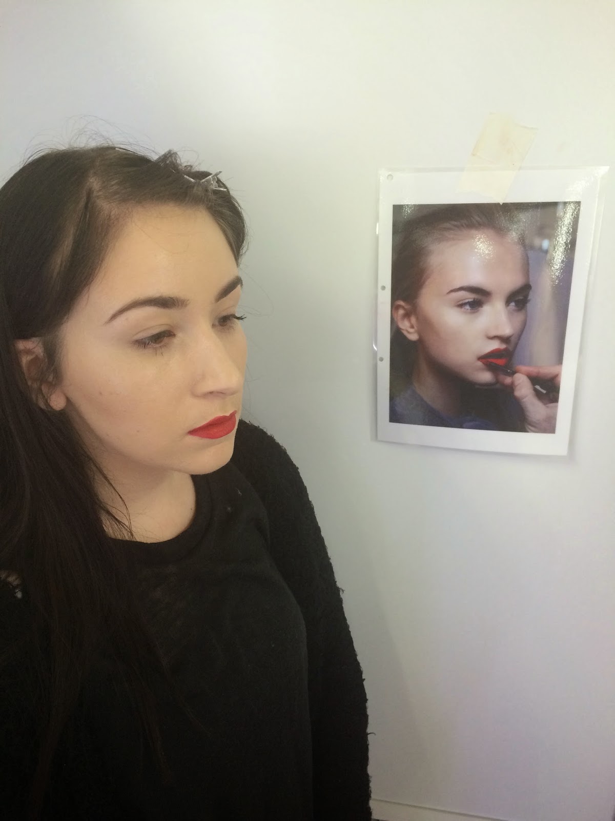
Last but not least for the all important look defining part. This bright and energetic was created first with Nars Velvet Lip liner in Playa Dorada. Then filled in with Nars Timanfaya Satin Lip Pencil 

Like previous shows I think this effortless and flawless look is very much a favourite of Tanya Taylor. The boldness of the lip really compliments the show well in fact I would even go as far as to say the lips made the show! 


Hair - Backstage
Hair - Backstage
The hair for the show was simple but had great surprises at the back. Alan Wood from Bumble and Bumble designed the hair.5 The loose braids were thrown back resting behind the model I really like this it mirrors the effortless theme perfectly. 

The products used from Bumble & Bumble were Thickening Hairsprey to help achieve the tidy parting at the front of the hair. From mid length down Dryspun Finish a texturising spray that is powdery and clear was used to a create texture within the braids.6 

Overall I think this look is great for spring. Its surprising and energetic but still has a really relaxed feel. The make up is light and airy. I love the element of surprises in both the make up and the hair. I can't wait to try out this look. 


Biblography 
1.http://www.strandednyc.com/tanya-taylor-ss15-nyfw-bumble-nars/


Wednesday, 3 December 2014

Burberry AW14 - Hair & Make up review


Burberry AW141
Burberry AW142
Burberry AW143

This year Burberrys AW14 Campaign was all about the capes and trench coats to go with elegant rosey shades of purple and olive floral leaf prints. Longline lengths seemed to be a recurring theme on the runway. 

The look for the make up was designed to mirror the ‘Bloomsbury Girl’ look of the runway.4 The make up designed by Wendy Rowe complement a clean subtle base with gentle contouring. This is not the first show Wendy Rowe has designed make up for Burberry having most recently worked on SS15 for the designer brand

For they eyes Nude Blush Complete Eye Palette was used to create 'a wash of aubergine on the eyelid'5 I think not only does this perfectly suit the hues of purple in the clothes but this also is a lovely winter colour to think about using. I find it really refreshing to see the use of such rosy tender purples because we tend to think of winter colours as being dark vampy shades and gothic greys and blacks. Because of this I also find this look to be really versatile and would be a rocking look to wear right through spring. Wendy Rowe rights on her blod that the look was tailored slightly to each girls face shape. I noticed Cara Delivigne wearing a slightly smokier heavier look in comparison to some of the other models who were given one slightly more subtle. This works well because on some looks the subtle feel seems to stand out more and on others a real smokey effect looks the correct way to wear the look given the choice of clothes. 

 A full brow has been added to create a strong look. Some looking heavier then others. Rowe explains on her blog the full brows were decided to give the models a stronger structure. 

For the base Fresh Glow in Golden Radiance6 was used to brighten and moisturise the skin. This radiant look seems to be a key theme to the look, each model looked fresh faced and dewy, I think this gives the make up a really nice balance. If there was a matt finish this would totally transform the look giving it a far more edgy harsher appearance. 

The foundation used was of course Burberry too. Keeping with the radiant appearance, Fresh Glow Fluid Foundation was used to give a 'real silky skin like quality'7 

No mention has been given about the use of mascara or liner however I can see that no mascara has been used I think this compliments the look well it keeps in with the fresh faced subtle look, this look is not one of high glamor to me it says less is more. I think this gives a really elegant feel one that you would expect to see from Burberry. 

For the lips Burberry Lip cover was used in Tulip Pink.8 This was clearly applied to the natural shape of the lips, this is a lovely touch and really brings some balance to the make up mirroring it with the eyes.


This is a gorgeous look from Wendy Rowe for Burberry, Its a new way to style your make up suitable for a fancy dinner or every day. It has inspired me a lot to experiment with colours I wouldn't necessarily go for. This look is really wearable for everyone. 


Lime Crime Venus Palette 
Lime Crime Instagram
Recently Lime Crime launched there new Venus Pallete. The looks that they have been posting on there Instagram are really similar to the look seen in Burberry's Campaign. I feel they have created a slightly grungier take on the AW14 look. The Venus Palette consists of some really similar shades of autumnal colours. 


Not much is available about how the look for this hair was achieved however I can tell you that the stylist for the show was the wonderful Christiaan. I imagine this look to be achieved with a straight blow dry adding some volume towards the ends of the hair. Also there looks as if some teasing has been given to the hair to create an almost naturally static look as if the models were going about there day to day. This is perfectly matching to the natural theme of the make up itself. I would use some hair sprey also to give some hold to the volume at the ends. The shape of the volume added is very free flowing with out definite curls the hair looks natural with an almost rolled out of bed feel. 


Biblography 
http://www.vogue.co.uk/brand/burberry
http://uk.burberry.com

Tuesday, 2 December 2014

Paddy McGurgan

I was lucky enough to have a brilliant work shop by lovely Make up Artist Paddy McGurgan, so I thought who better to do a biography on then the man himself considering I got to ask him plenty of questions. 

Paddy McGurgan like many artist did not intend to get into make up as a career. He graduated with a degree in music working for some time as a music directer. Shortly after this he gained a job at Mac in in London away from his hometown of Belfast.This was not a make up job this was cashier related. Working at Mac Paddy became really enthusiastic for make up and with plenty of 'pestering' he eventually stayed on to work as a make up artist for the brand gaining plenty of training. Given that Paddy had a creative start to life with his musical background make up was a road Paddy was still able to express his creativity. 

Next from Mac Paddy moved to Space NK and here he received training from the likes of Francois Nars himself and even Laura Mercier herself. This type of training is invaluable to his career as he was able to pick up a lot of different skills from a lot of very talented people.

Paddy says one thing that helped him was his nosiness he was always asking why and what he was using rather then just doing what he was told. He said to us 'never forget to sit and start playing with make up' Paddy is big on constant training he continuously told us that you never stop learning as an artist and I think this is completely true. This is also written on his website. 

Paddy has worked for a number of celebs speaking a lot about his appreciation for his regular client Ruby Wax and listing a number of cool British celebs such as The Saturdays. He has also done plenty of beautiful editorial shoots creating looks for magazines such as the Irish Hair dressing magazine. 

Aside from this Paddy now runs his own course were he helps student over 8 weeks covering bridal, fashion and artistic make up. In Paddys workshop he created a evening look and then transformed it into a fantasy inspired look layering lots of colour and glitter to create something magical. I learnt a lot from his amazing ability to blend endlessly to create an entirely new look from something totally different. I felt his skill with the brush was really inspiring.
Evening Look 
Fantasy Look


Currently Paddy has his own Make up Store known as the Make up Pro store in his home town of Belfast. Paddy picked himself a range of brands to accommodate for professional artist and make up fans. They stock brands such as The Make up Studio as well as Paddys own range of items. 


I particularly love this work taken from Paddy's portfolio. This make up is really creative and for me is up there with the likes of Alex Box's creativity levels. The use of the leaves to create texture flowing from the head to the neck gives a really earthy feel as well as the make up which uses plenty of golds to help the leaves stand out. I feel theres a lot of detail to this look and is very inspiring for my creativity. 


The Alex Box

Alex Box1
I have decided to right about Alex Box she is a very inspiring artist whom I always follow she embraces the weird and wacky and is a wonderful example for many people. 

Alex Box is the creative director for Illamasqua. She grew up in Grimsby, Lincolnshire before moving to London to study Fine Art at Chelsea College of Art and Design.2  I think this is key to Alex Box style for me her work is more of an art form then just simply make up. She crosses the borders between art, history, science, crazy and the wacky. 

After studying fine art Alex box moved on to training in Make up Artistry. Since then she has worked with some of the biggest names. Working for designers such as Gareth Pugh, Karl Lagerfeld, Alexander McQueen, Stella McCartney and Chanel.3 Alex Box's work has also featured in Vogue, Stylist Magazine, Another Magazine and many more.4 Her celebrity clientele list is also endless having created beautiful make up for the likes of Lady Gaga, Azealia Banks,Kate Moss, Sienna Miller and Courtney Love.5 

As Creative Directer for Illamasqua Alex Box shapes the brands products. I follow her on Facebook and Twitter were she's regularly posting about up and coming products sharing with us the inspiration and meaning behind them. As a make up artist this is really helpful for me her product knowledge she shares with us helps to keep me up to date. 

One thing constant throughout Alex Box's Legacy is her outstanding ability to create texture in my opinion she creates texture in ways you would never think such as adding three dimensional bubbles, rough surfaces to the face, high areas of shine. For me this pushes her work into new boundaries were you can really describe it as an art form. Her colour scheme is not limited I feel as though I have seen every colour under the sun used by Alex Box and then some. To the point were I look at her work and think Wow that colour is amazing as though Ive never seen it before! She is a master at shade in some examples of her work she creates looks based on one colour such as the second one below. Still despite one colour being used they are more vibrant and powerful then some that use every colour in the rainbow.


 Alex finishes her website bio by quoting 'My Work has always been about embracing new formats and emerging technology.Through my marriage of art and Science there is an endless landscape of possibilities' This is something that I wish to take a piece of through my journey as an Artist Alex box works with a creative flow that has no boundaries always making a lasting long impact. Her looks are some of the ones that never leave my head when Im thinking about inspiration whilst working. In particular I wish to take on her bravery with the use of texture and incorporate it into my work. 


Bibliography


Recreating Catwalk Looks


In todays work shop with Branka we worked on re creating a make up look that would be perfect for catwalk. Branka gave out a random selection of photos to copy. I was given this lovely classic red lip look. This look would be perfect on Catwalk for someone like Scarlotte Johanson for example. 

Above is the look that I was given to re create. To begin with I cleansed toned and moisturised my models face. Although she had already taken her make up off there was a lot of excess mascara around the eyes I really wanted this to be completely gone given that this is such a clean look. Working cleanly and neatly I used my pop up bin on my work station placing all the dirty cotton pads out of sight. I then began with the foundation for this I used Mac Face and Body CI. My models skin is very pale and this was the lightest that I had. I also used Face and body because the look I was re creating has a very subtle base that looks extremely natural and so I didn't want to give my model ay tan or colour. With a clean foundation brush working on the back of my hand which had of course been sanitised I worked the foundation on the back of my hand for a good minute I did this to warm up the foundation and to thicken it slightly for denser coverage. I found in the past applying Mac Face and body can be difficult if applying it straight on the face because its extremely thin. I also think the coverage is a lot better once it has been warmed up on the back of the hand. Once it was to the right consistency for me I applied it to my models face working from the centre outwards. I always start from the centre when applying foundation so not to leave a foundation line around the outside of the face, this doesn't happen because I blend outwards using minimal product because this was an assessment I spent a lot of extra care in making sure the coverage was even and smooth taking it right up to the models ears and blending down the neck as you would if this was for a real catwalk show. For the under eyes there wasn't much darkness only a little of which I covered using the Pink from my Mac Concealer pallet. 
I powdered the face but not all because as you can see in my Visual my model does have some dewiness. Because of this I decided to powder the T zone area only. 

My second step was to focus on the highlighting of the face. In the look I recreated the models face has really clearly highlighted areas such as the front of the nose, around the eyes and the chin. Because my models skin was quite pale I wanted to create a highlighter that was obviously even lighter then my model to get around this using my spatula I took a little bit of Kryolan White from my greasepaint pallet and mixed it in with an even smaller percentage of Mac Face and Body C1. With lots of mixing this created a colour that was lighter then my base. I applied this to the areas I wanted to highlight continuously looking back at my visual for insurance. The foundation brush I used didn't blend this in well in my opinion I felt I needed something softer so I used a small blending brush to apply the highlighted colour onto my model. This worked a lot better in some areas I also used my fingers just to get a perfect blend from base to highlighted area. 

It was now time to work on the shading of which I allowed my self 5 minutes to do given that we had 45 minutes and I wanted to allow plenty of time for applying the lip colour. To Shade and Contour the face I used a Mac Bronzer. I applied this to the cheeks and temple area. I also applied it to the jaw line as seen in my visual. When I was applying it to the Jaw line I took it right up behind the ears. I did this to provide some flow to the look. I think its important that make up goes some wear and has some direction, especially if it is to look natural. 

When it came to my next step which was filling in the eye brows I was pleased because my models eye brows wear very full and had a beautiful shape this I feel made my job easier. In order to give them a similar shape to the one in my visual I shaped them with eye brow gel. I made them a lot more rounder to match the model in my visual. I then filled them in with a small clean angle brush and used my Ben Nye pallet mixing a combination of two shades of lighter and darker browns. I filled in the brows on the areas that needed filling such as the front were there was less hair. I also went along the hairs of my models eye brows with the angled brush just to enhance the colour ever so slightly. 

It was now time to do the lips which I had purposely allowed myself 10 minuets to do. This is because lips are my least strongest part of make up and I needed to allow room for error. Which was lucky I did because I did face some problems along the way. This is because I lined the lips using MAC Cherry Lip Liner.To clean the pencil I sprayed it with IPA and then sharpened once. I lined the lip using the liner creating a round cupids bow the same as the one in my visual. Because I have been practising lips a lot I didn't struggle too much with lining the lips. My problem was when I stepped back and looked in the mirror the colour of the lip liner was completely wrong. Cherry is a very dark and cool red and the models lips were a very warm almost blood orange red. I was running out of time and didn't have enough time to wipe off and reline the lips so I worked on correcting the colour. By this time I had realised that using Ruby Woo red was going to completely change the look as well as this too was not the right shape of red. I quickly looked in my make up bag and pulled out my Kryolan Greespaint Pallet. Int there was the perfect blood orange colour. So I used this to fill in the lips, although it was the perfect colour I still had the problem of the cherry lip liner around the lips which looked extremely obvious. I used my smallest round blending brush to blend out the lip line blending it into the lip colour.
I was really pleased by my efforts because this worked really well and my feed back from Branka was that she never noticed that the lip line was blended off. 
Despite this though I wasn't happy with the finished lips because I feel the overall shape especially on the top lip could have been slightly bigger and higher. I feel I refrained to much to the natural shape of the cupids bow and didn't take it high enough like the one in the

Finished Look 
Finished Look 


Monday, 1 December 2014

Chanel Rouge Allure Gloss

Chanel Rouge Allure Lip Gloss. Vogue November 2014 issue

Rouge Allure Lip Gloss1
Today I opened up Novembers Vogue magazine to Chanels beautiful campaign for there Rouge Allure Gloss lip gloss. I really like this campaign to me it says classic Chanel! When I was working on the Chanel counter this was the look they gave us as a guideline, a classic red lip, minimal eyes, beautifully applied foundation and hair tied back into a bun which I instantly imagine the model to be wearing. The lipstick is extremely bold whilst still providing a lot of shine.This look was published in Vogue for the winter season. 

The base is a very clear and defined with a very illuminated feel. This base is similar to the faces we saw on Marc Jacobs clean bare faced look. Perhaps this is channels interpretation. Although I do think this look is very typical and classic of Chanel. The lighting has been used to help create a very well structured oval shaped face. 

Not much make up has been applied to the eyes. Some definition looks obvious in the crease line. Only using warm a warm shade similar to the skin tone. This really helps to create a natural appearance. Its clear the focus of this campaign is purely the lips. Eye shadow has softly been applied to the lash line also. The same colour as the crease line. This really opens up the eye and provides some balance to the look set for the eyes. The mascara has added some serious length. I do think it works perfectly well having no false eye lashes as this is a classic look. 

Again brows do not detract away from the lips, they are filled in ever so slightly following the natural shape. They frame the face gorgeously with the perfect depth. I think this creates a great balance. 

For the Lips Rouge Allure Lip Gloss has plentifully been applied. However I do think the lips have of bee lined. I think this works well and has helped to create a fuller feel and a lovely classic shape suitable for a Chanel wearing women!.

Lucia Pica2


The Make up Artist for this campaign was Lucia Pica. Lucia Pica is an italian Make up Artist based in London. She is very inspirational for me as an up and coming artist because her work is extremely daring and out there.

Sunday, 23 November 2014

Classic Red Lip


The all important classic red lip was todays subject. We recapped lining and filling in the lips using Mac Ruby Woo red a colour that suits nearly all!  

To begging the Lip I lined using Mac Cherry Lip liner. To prep the lip liner I sprayed with IPA to cleanse the pencil and then sharpened once. I do this before using any pencil to ensure my pencil is clean and safe to use! Matching my lip pencil to my Lip colour is really important. Using a pencil on the lips gives more staying power to the lip stick. 

When I was first introduced to make up by celebrity make up artist Karen Mason she showed me this diagram that should be followed when applying lip liner. I am sharing it because its something that I never forget and is away to create neater lip lines. Drawing from the outer corners to the inner centre of the lip is also a lot easier because you can see clearly what you are doing. 
1


A really comfortable way to give your self support is to rest your arm gently on your models shoulder supporting her head whilst using your other hand to draw onto the lips. Working in this way gives me a lot more control and comfortability. Im not resting at all hard on my model in fact she found it a lot more comfortable as it helps her to keep still and feel secure. I lined the lips ensuring in the mirror that the line was even and symmetrical on both sides. I faced some minor hiccups with this because on one occasion I drew over the natural lip line a little too much. To correct this I used a cotton bud dipped in toner and wiped the excess off. I found lining the top lip a little difficult because my models lip line was very faint in fact when I look back on the final image it looks almost slightly exaggerated and perhaps the cupids bow lip line could have been made just a little more subtle. After I had lined the lips I asked her to open her mouth slightly and I filled in the corners with the side of the pencil to ensure the colour was all over. I also think its important to line the corner of the lips with a pencil instead of a lipstick because lipstick can build up in the corner of the mouth and this isn't what you want to look at!

I filled in the lips using a clean lip brush loaded up with plenty of lipstick. Holding it steady I filled in the holding it pretty much flat, I find using the tip moves the product around a little too much. For this look no lip gloss was used.

In todays work shop I learnt a new way to matt a lipstick. This was done by covering the models lips with one layer of tissue and then powdering over the tissue covered lips. This gave a really nice matt finish and would be great for longer lasting lips. 


Red Lip is probably my favourite lip look so I couldn't resist practising on myself using the same products!

1. Lining the lips 
2. Lining the lips
4. Lipstick applied over pencil


3. Filling in the lips with pencil