Sunday 26 October 2014

Creating a 'natural' base and a 'full coverage' base.

In todays Workshop we discussed and practiced ways of creating a natural "No makeup look" base in comparison to "heavier" coverage base suitable for photographic shoots and Tv & Film. 

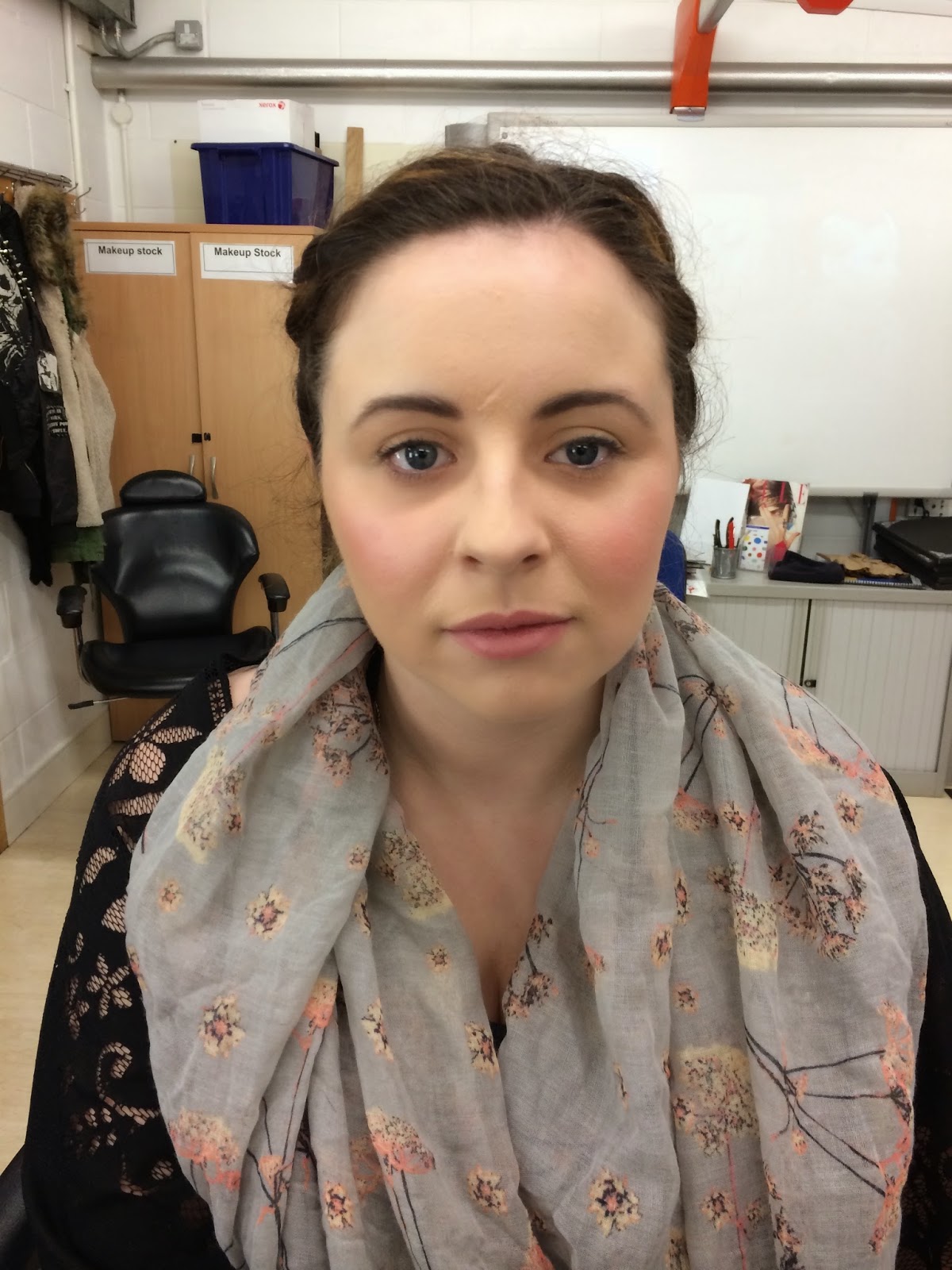
In this photo my model has the heavy base on her right side of her face. Unfortunately I didn't manage to get a photograph of the natural look base however I will be practising more of this look so will be sure to upload an example soon! 

Products used - 
  • Jurlique Moisturiser
  • La Maquillage - foundation palette with pink tones
  • Kryolan - Dermacolour Camouflage creme mini palette
  • Mac - Prep & Prime 


I think I have been quite successful with creating this heavy base but I do think there are some things that I will do differently from now on.

To start with in my demo it was explained when creating a heavy coverage its best to go in with the concealer first, this is because we are trying to achieve a heavy base so we want to be sure to cover all blemishes before going over with the foundation. On the other hand when creating a natural light base its best to go straight in with the foundation as this may be enough to conceal blemishes without the need for a concealer. There are other reasons for using a concealer first such as ensuring a correct colour match or to use minimal make up but in this case this was the purpose of using it first for the heavy coverage. 

I found working with the la Maquillage pallet slightly harder then using the Mac Face and Body for light coverage. Not only because I'm not used to it but because its a lot heavier and really needed to be worked into the back of my hand to loosen it up. I found it also needs to be mixed with other tones to create the right colour for my model where as often when using Mac not as much mixing needs to be done.

I feel my colour matching was to a good standard although I had some difficulties. When I was creating a heavy base as I was building the colour it started to get a little to warm I put this down to my inexperience using La Maquillage foundations, next time I must allow the foundation to oxidise for longer on the back of my hand and make sure the colour is a definite match with more test patches on the forehead where my models skin was lighter. 

 I overcame this by going over the face with a cooler foundation using back and forth brush strokes of the tip of the brush. This really cooled down the foundation and looked a lot better. And then applying Mac Prep&Prime to tone down the shine from using such heavy coverage. Unfortunately I don't have a picture of my end result. 

After this workshop I definitely prefer the natural base personally on an everyday basis not only for how it looks but also for comfort, the full coverage base feels uncomfortable and heavy on the skin.

Below is a picture of my Tutors Demonstration.
Left side - Heavy Base 
Right side - Light Base


Colour Wheel & Colour Matching 

Colour Matching is one of the most important elements of Make up Artistry.  

Below I have filled out a colour theory chart to help with understanding the Principles of Colour. I have further explained the main theories giving some examples. 


I feel learning these basic principles are essential and have really helped me in a number of ways, I find that I almost always need to mix colours when performing a make over. In body painting & face painting I rarely have all the colours that I need so I use the colour wheel to help me achieve what I want. 


In this example to the right I have added white to create a pale delicate parma violet colour from a very heavy Grimas Purple paint. Ive been careful not to add to much white to prevent it from being chalky.


Complimentary Colors
Complimentary colours lie directly opposite each other on the colour wheel. These are helpful when you want to create a strong contrast in any make up look. This can be really striking on the catwalk. 
Harmonising Colours
Complimentary colours can be used to tone down down each other. So if my red was far to bright by adding blue this would help to tone down the brightness.


Here is my example of Harmonising colours, these are colours that share a pigment on the colour wheel. Blue shares a pigment with Green because it is yellow and blue mixed together.  So in this example the two colours next to each other appear well blended because they harmonise. 


Bibliography

Delamar, P. (2003). The complete make-up artist. Evanston, Ill.: Northwestern University Press.
Marc Jacobs "Bare Faced" - SS15 New York Fashion week
I really loved this look from Marc Jacobs SS15 campaign in New York's Fashion Week. 
Models marched the catwalk in military style clothing,bare faced, and a ruff cut messy Bob.
Of all the campaigns for SS/15 New York this possibly for me was the strongest. I think this look really draws focus to the uniform style clothing. Having models bare faced is a huge  statement for the clothes. 

All the models skin looked extremely radiant and bright, I can think of a number of products that could have been used to achieve this look for a brightening effect to the skin. 

One of my favourite products I use to achieve this type of radiance is Jurlique Herbal Recovery Advanced Serum available at Selfridges, John Lewis and some other London department stores. Another more pricier option for achieving this look is Sisley - Lightening Hydrating Emulsion which is perfect for long term use and longer lasting results. I saw a lot of positive feedback from customers about the effectiveness of this product when working on the Sisley counter.  Founder of Nars cosmetics, Make up Artist Nars Francois revealed Nars Luminous Moisture Creme was used on the models to brighten up the models 'bare faces' 

Mac Impeccable Face Collection


Recently Mac have launched a new 'impeccable face' collection. With Mac always one step ahead its clear how popular this look is going to become not only on the catwalk from the influence of Marc Jacobs but now on the streets thanks to Mac. I recently went to Macs Carnaby Street store and had a chat with one of the advisers about this collection. This is Macs way of offering customers a way to achieve the bare faced look with very very light make up especially for those that aren't quite ready to go completely bare faced as we saw on the Catwalk. 

The collection offers Mac Prep & Prime CC Colour Correcting Cream this is a great moisturising primer that helps to even the skin tone. As a base they then advise the use of Studio Face & Body I think this is a great choice if I had to choose a foundation that I could use to achieve a bare faced look I immediately this would come to mind. This product is really light and can give a very no look make up look. Having practised more and more with this foundation In workshops at College I have discovered its very build-able and with lots of work onto the back of your hand it will thicken up to create a much more heavier coverage foundation. To finish the look the collection offers Mineralise Skin Finish this product has a slight metallic finish which is great for achieving that illuminated bright look that Marc Jacobs used for his SS15 campaign.

The advisor at Mac was really helpful and she also showed me some alternatives to achieving this look with some of there skincare for those that do want to embrace the complete bare face look. Such as their Lightful Softening Lotion which over time works on the skin to soften and achieve a more radiant look.


Marc Jacobs SS/15 New York "Hair" 
With wigs being used on the catwalk, again I think this really contributed to creating a real uniform look for the military style show. With the hair being repetitively styled it allows all focus to be only on the clothes with no influence from the model behind the wig. This is why Marc Jacobs campaign seemed as if it had more importance then others!

Looking at the models it seems all the cuts are the same with some slight alterations to fit the shape of their faces. I think a few sprits of water has been applied for the slightly 'damp' look and some curling spray would have also been used. I think this is really effective for the army styled theme as its not too perfect the 'ruff cut' gives the perfect edge complimenting the clothes perfectly. 

The hair for the campaign was designed by Guido Palau British Born hair stylist known as the leading trend setter in the fashion industry


Bibliography
Vogue UK, (2014). Vogue.co.uk Homepage. [online] Available at: http://www.vogue.co.uk/event/new-york-fashion-week
5. Wikipedia, (2014). Guido Palau. [online] Available at: http://en.wikipedia.org/wiki/Guido_Palau [
4. 5. 7. Vogue, (2014). Guido Palau - Photos - Vogue. [online] Available at: http://www.vogue.com/slideshow/misc/guido-palau/#1658029 
8. WWD, (2014). Guido Palau: Style, Defined. [online] Available at: http://www.wwd.com/beauty-industry-news/hair/guido-palau-style-defined-5773562